Rich black, or deep black, is a color used in many printing methods to get a darker black on the final product. This applies to just about any process that mixes colors while printing to create a full-color image – such as digital inkjet or offset printing.
In digital sign printing, the printheads move incredibly fast over the sign depositing tiny droplets of ink. This builds an image one “pass” at a time.
A full color yard sign coming to life on a large format, digital printer.
The full color imprint is achieved using a mix of Cyan, Magenta, Yellow, and Black inks (CMYK) literally shot at the sign material and cured in place with ultraviolet light. Any white allowed to show through from underneath the ink will lighten or fade the color you see.
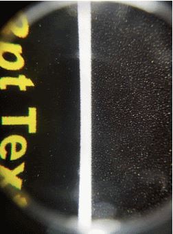
As you can see in the image to the right, the droplets for Standard Black (right) are not as dense as they would be if all four colors were used (left).
So how do we get the darkest, richest black possible?
We cover up as much white as we can! By telling the printer to use all 4 colors, CMYK, instead of just black, we get the darkest black possible – Rich Black!
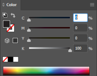
Standard black in Adobe Illustrator or Photoshop, for example, is created using 100% K (or Black).
When printed, this will appear as a dark gray color.
Below, you can see rich black being used. This will be very dark.
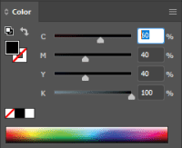
At FireSprint, if you want rich black on your signs, we suggest you use a mixture of C, M, Y, and 100% K to achieve that “true black” most people are used to.
We’ve found 60, 40, 40, 100 (CMYK) to be the best combination of inks for FireSprint and the rigid and flexible materials we print on daily; however, as ink absorption will change from substrate to substrate and printer to printer, we recommend working with a knowledgeable printer to find out which variations of CMYK work best for your material.
Why not use Rich Black all the time?
For most everything we print here at FireSprint, we like using rich black all the time, but for very small, black text, you may get a better result just printing with a single color (100% K). This is because if there is any misalignment of the colors during production, small text will quickly show this, and the text will be harder to read.